
If you’ve been on TikTok recently, the chances are high that you’ve come across color analyses. From beauty to clothes, people are turning to the pros to find out which colors best suit them. (Any other warm springs out there?)
Of course, color is just as key in interior design, so when I learned Little Greene Paint & Paper offers a color analysis service for your home, I jumped at the chance to have one done myself.
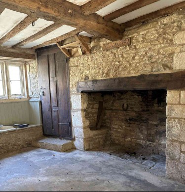
I tapped the team to help with our work-in-progress: a 17th-century cottage in the Cotswolds countryside. While some of our colors have already been determined, Pernille Howarth at Little Greene Paint opened my eyes to a world of possibilities I had never considered.
Here was my experience getting my house professionally analyzed by a color pro, and I was completely floored by some of the selections they made.
Meet the Expert
Pernille Howarth is a paint color expert from Little Greene Paint and is a part of the company’s Greenwich team.
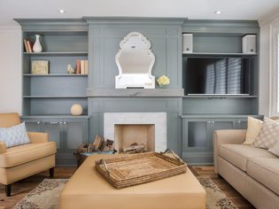
The Full Process
Ashley Chalmers / The Spruce
Little Greene Paint offers two consultation options—either in person on-site or virtually. While I think in person would have been fabulous, we had a few barriers to this. We don’t live super close to our cottage, and it is currently a complete construction zone.
To kick off the consultation process, Little Greene asked me to share as many images and videos of the cottage as I could. I set up a shared drive for Howarth to access, and she sent me a Color Consultation Pre-assessment to complete.
This was an online form full of fun questions that had me thinking about the general feel of the space. We touched on any colors and wallpapers I’ve already decided to use, color schemes I’m drawn to, and our goals for the final aesthetic.
I noted that our overall hope for the home is a calm and relaxed feel, with a nod to the gardens and wildlife that make the Cotswolds so special.
Our Video Call and Final Specification
The next step in the process was to hop on a one-to-one thirty-minute video call with Howarth, who talked me through some of her initial suggestions.
A few days after our call, an email from Howarth landed in my inbox, and attached was my final specification. This included all of her thoughts for each room, and featured a few wildcards that I never considered—but absolutely loved.
She also attached images of her paint samples so I could compare them against my own color scales I picked up from a local Little Greene showroom.
Without further ado, here were the team's selections for my home.
Ceilings and Trim
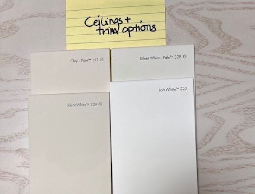
Pernille Howarth / Little Greene Paint & Paper
Most of the walls on the ground floor are stone and will stay that way, So, Howarth offered suggestions for ceiling and trim colors. We both agreed these should be neutral, soft, and simple.
She suggested Silent White #329, Silent White-Pale #328, Clay-Pale #152, or Loft White #222 for the ceiling and trim. Because the house is small, I want all of our ceilings to be the same color, so getting a few suggestions was incredibly helpful.
This will keep my options open so we can choose one that works across all of our rooms.
The Kids’ Bedroom
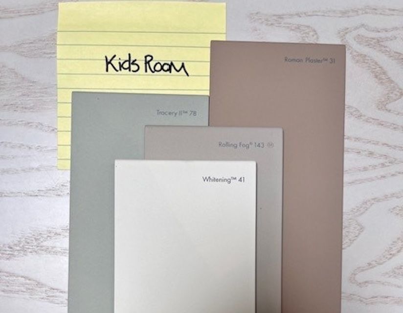
Pernille Howarth / Little Greene Paint & Paper
From there, we talked through the bedrooms. For now, our two young children will share one bedroom, which means we need a gender-neutral base.
She suggested a few earth tones that would look beautiful and age well. The final specification included Little Greene’s Lute #317, Roman Plaster, and Tracery II #78, with Whitening #41 as an accent to add some interest.
So far, Pernille's suggestions were stunning and safe—definitely in line with hues I've already been considering.
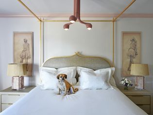
The Primary Bedroom
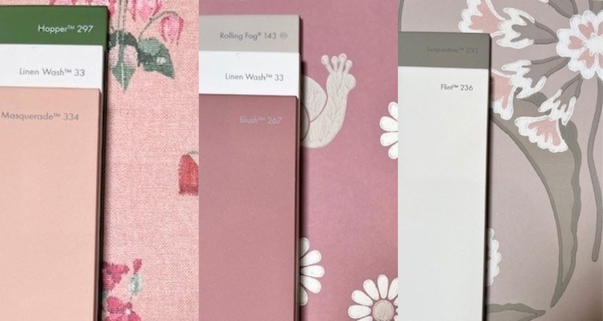
Pernille Howarth / Little Greene Paint & Paper
While we had some limitations with the other spaces, I told Howarth the primary bedroom is one space I'd love something bolder. With this revelation, her eyes lit up. She suggested going blush with pops of green and maybe even wallpapering some or all of the space.
When my assessment arrived, I was thrilled to find these were the colors that most surprised me—and also made me the most excited. I absolutely love all three and am currently torn between Serpentine and Flint with the Hencroft paper or Hopper, Linen, and Masquerade paired with the Millefleur wallpaper.
The Loft-Turned-Library
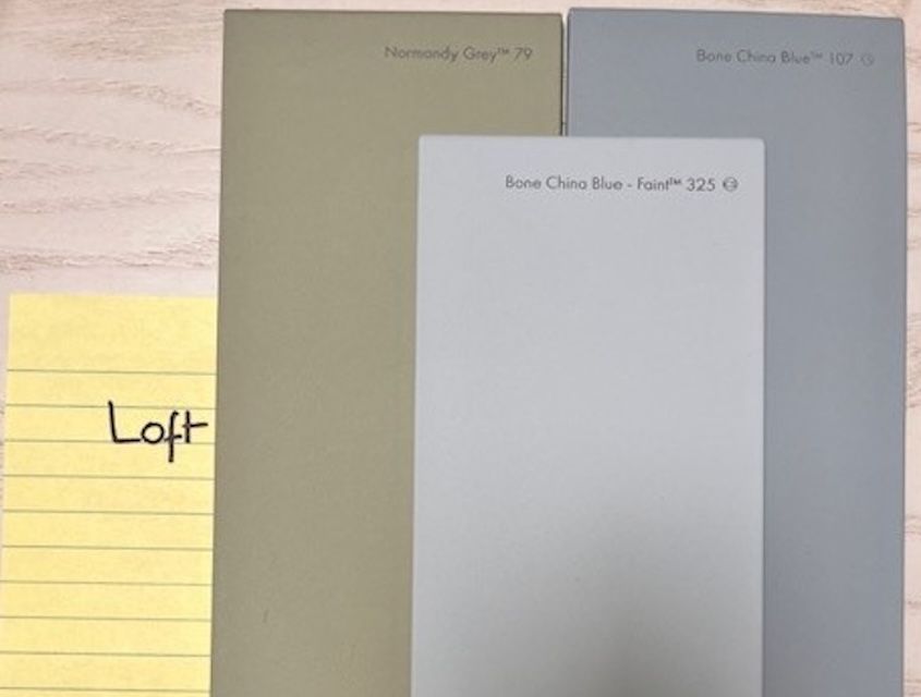
Pernille Howarth / Little Greene Paint & Paper
At the top of our house is a small, peak-roofed loft that we hope to convert into a home office and library space. While I always imagined we’d keep it white or cream, Howarth said she had other ideas.
When the spec arrived, I was the most thrilled with this unexpected selection. Howarth suggested Bone China Blue #107, Bone China Blue– Faint #325, and, what she called her ‘"wildcard," Normandy Grey #79.
All three are stunning, but Bone China Blue in Faint called to me immediately.
Overall Experience
While I knew I’d enjoy the outcome of finding out which colors would best suit our space, I didn’t realize just how much I’d love the process, too.
The entire Little Greene team was incredibly lovely to work with from start to finish, and I’m still floored by the colors Howarth suggested. I can’t wait to finalize our choices further down the line.
One thing I would suggest is to pop into your local showroom or go online to order their color scales ahead of your call. While I was able to pull up the website during my video call, it was much better to look at these in person—set against my other samples, and, eventually in person at our cottage.
If you’re interested in a similar experience, Little Greene offers in-home, in-store, and virtual color consultations. Prices start at $195.
Recommended Articles
How to Calculate How Much Paint You Need
When embarking on a paint project, the last thing you want is to spend too much or too little on the paint you need. Buy too little and you're interrupting your project to run back to the store. Buy t
5 Reasons You Should Think Twice Before Painting Brick, Pros Say
Brick is one of those designer-favorite materials that is timeless and can add unique depth and texture to architectural elements, both indoors and out. “It creates a dynamic balance of light and shad
What Is Retro Design? Explore Its History and Key Elements
Retro style is making a major comeback and is especially popular among millennials. We spoke with designers who reflected on the style's origins and key elements and also offered advice for those look
3 Design Trends Designers Regret Following—and What They Wish They Had Done Instead
It’s no secret that design trends don’t always stand the test of time. Sometimes, buying into a fleeting design trend can lead to major regrets down the line, especially if it's expensive or difficult
5 Tips for Restoring Your Dated Home That Won't Break the Budget, According to Reno Pros
Key Points Light, neutral paint on walls, trim, or even floors can refresh a space and make it feel more open. Swap outdated hardware, light fixtures, or curtains for affordable upgrades.Cleaning out,

How to Pull Off a Live-in Renovation
Let’s face it: undergoing a renovation while living at home is no easy feat. Of course, it’s exciting to finally see your space as you envision it. However, there are the inevitable loud noises, lengt

Standing Seam Metal Roofing: Know Before You Buy
For a long time, your main option for roofing materials was asphalt shingles. Most metal roofs were confined to commercial buildings or to higher-end residential structures. Now, standing seam metal r

There Is a Right Time to Paint Your Home's Exterior for Best Results, Reno Pros Say
There are a variety of factors to keep in mind when you are deciding when to paint the exterior of the home. If you choose to paint during the wrong season, time of day, or weather then you may end up